Kultura Brand Identity
The project was done as part of the Visual Identity Course by Hoodzpah. Cohort 1, Aug-Sep 2024. Project completed 2025
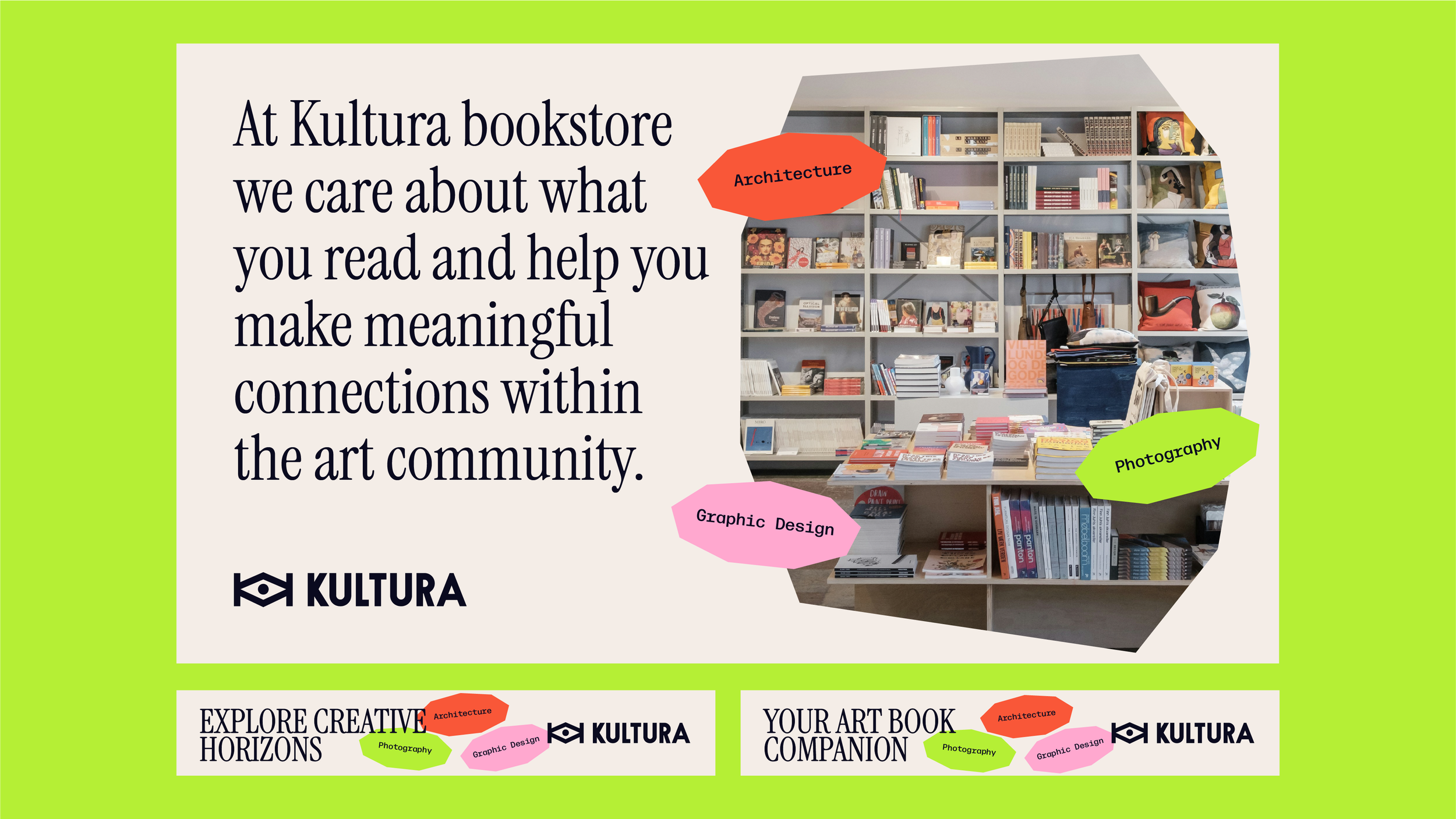
Kultura is a bookstore specializing in non-fiction literature focused on graphic design, photography, and architecture. More than just a retail space, Kultura functions as a creative hub and community platform, hosting events, lectures, and conversations by and for creative professionals.
The aim is to develop a comprehensive brand identity for Kultura, including tone of voice, brand values, and visual communication. The brand is tailored to a focused audience: professionals and students in design, photography, architecture, and the visual arts.
The identity should feel engaging, creative, authentic, and inclusive. At its core, the brand seeks to inspire and connect creatives through essential literature.
DELIVERABLES: LOGO, TYPOGRAPHY, COLOR PALETTE, MERCHANDISE, SOCIAL MEDIA ASSETS, BRAND GUIDELINES

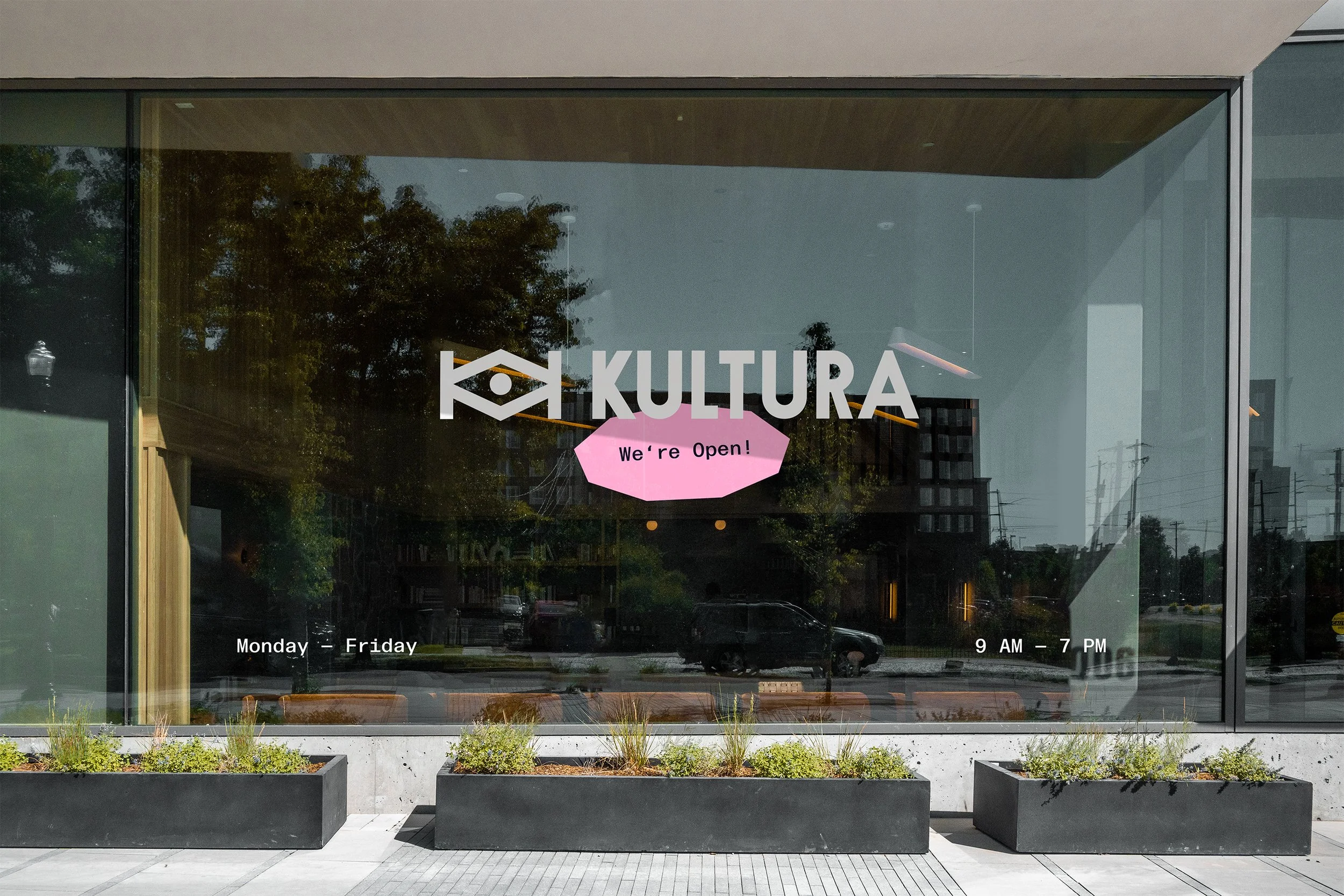
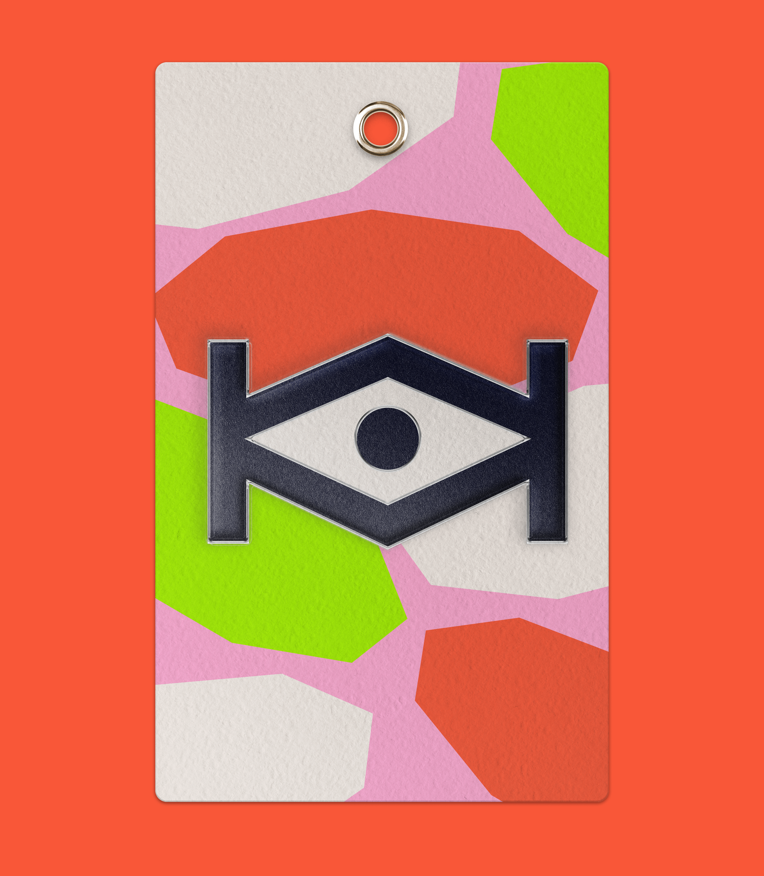
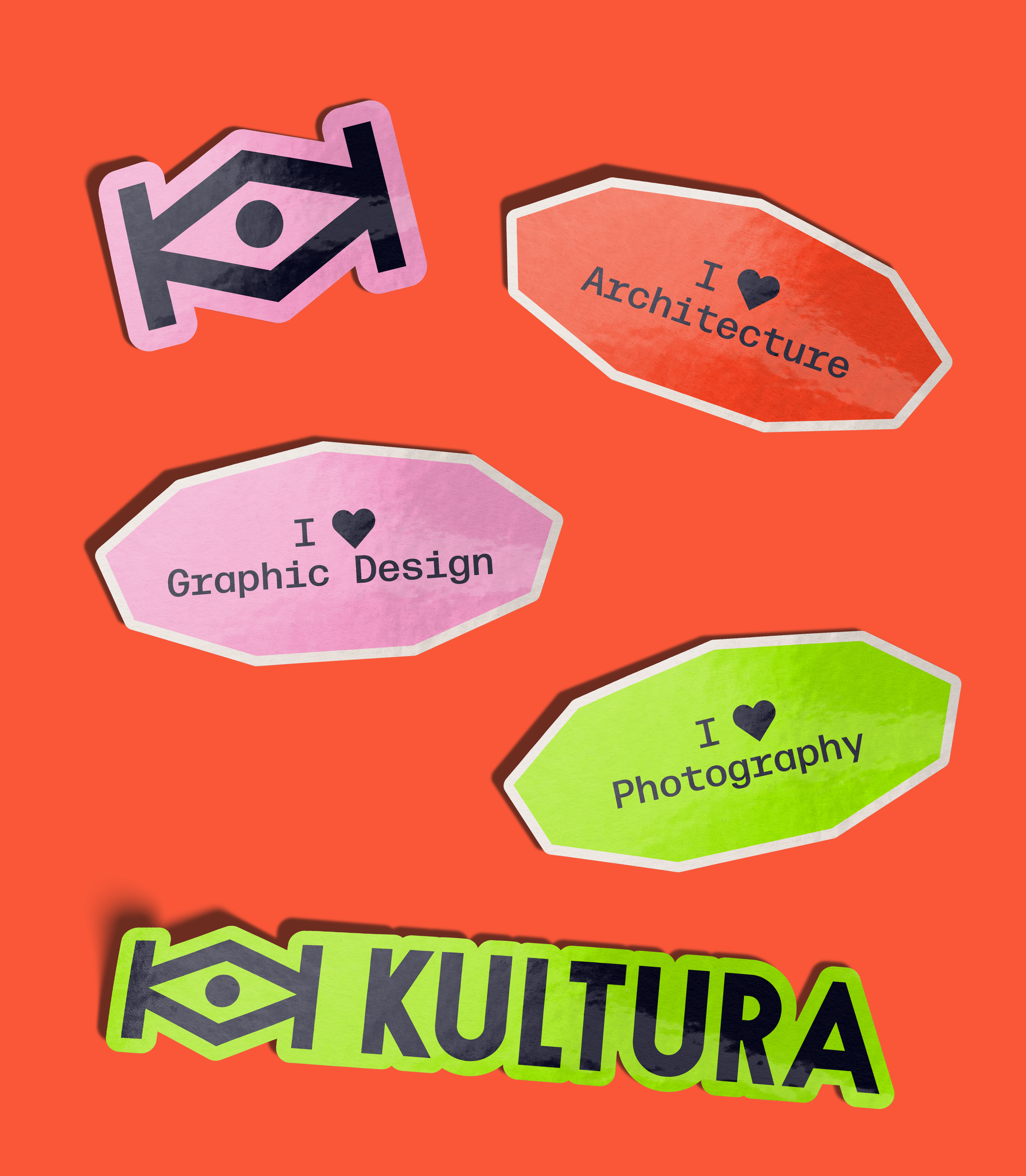
The logo design is clean, bold, and geometric, with a focus on clarity and memorability. The logomark is formed by two mirrored "K" letters, creating a distinctive symbol that subtly resembles an eye.
This eye motif represents vision, observation, and insight, serving as a metaphor for the artist’s gaze. It reflects both how we perceive the world and how the world, in turn, perceives us.
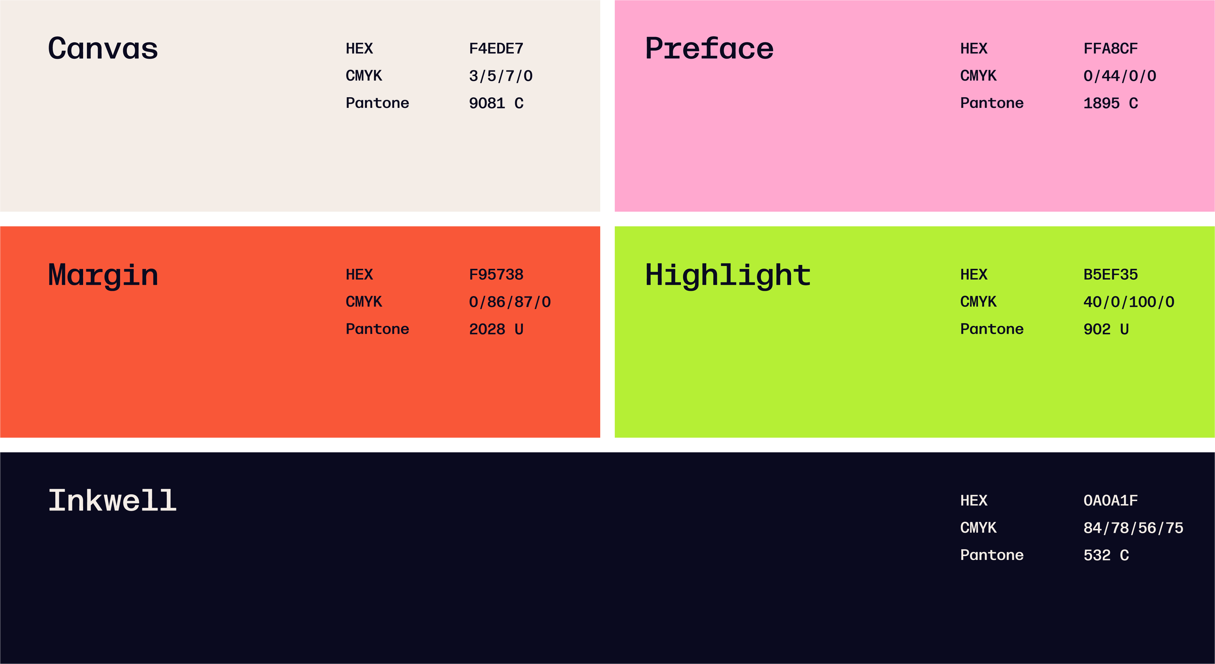
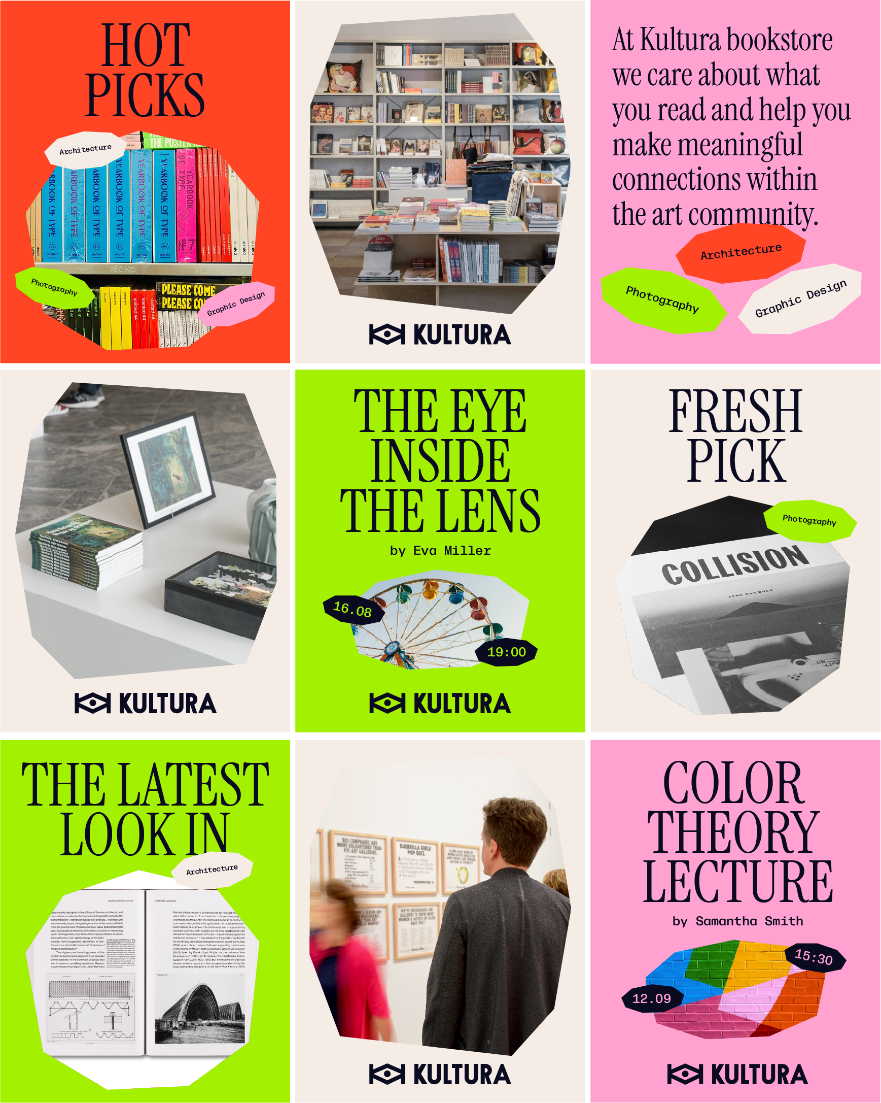
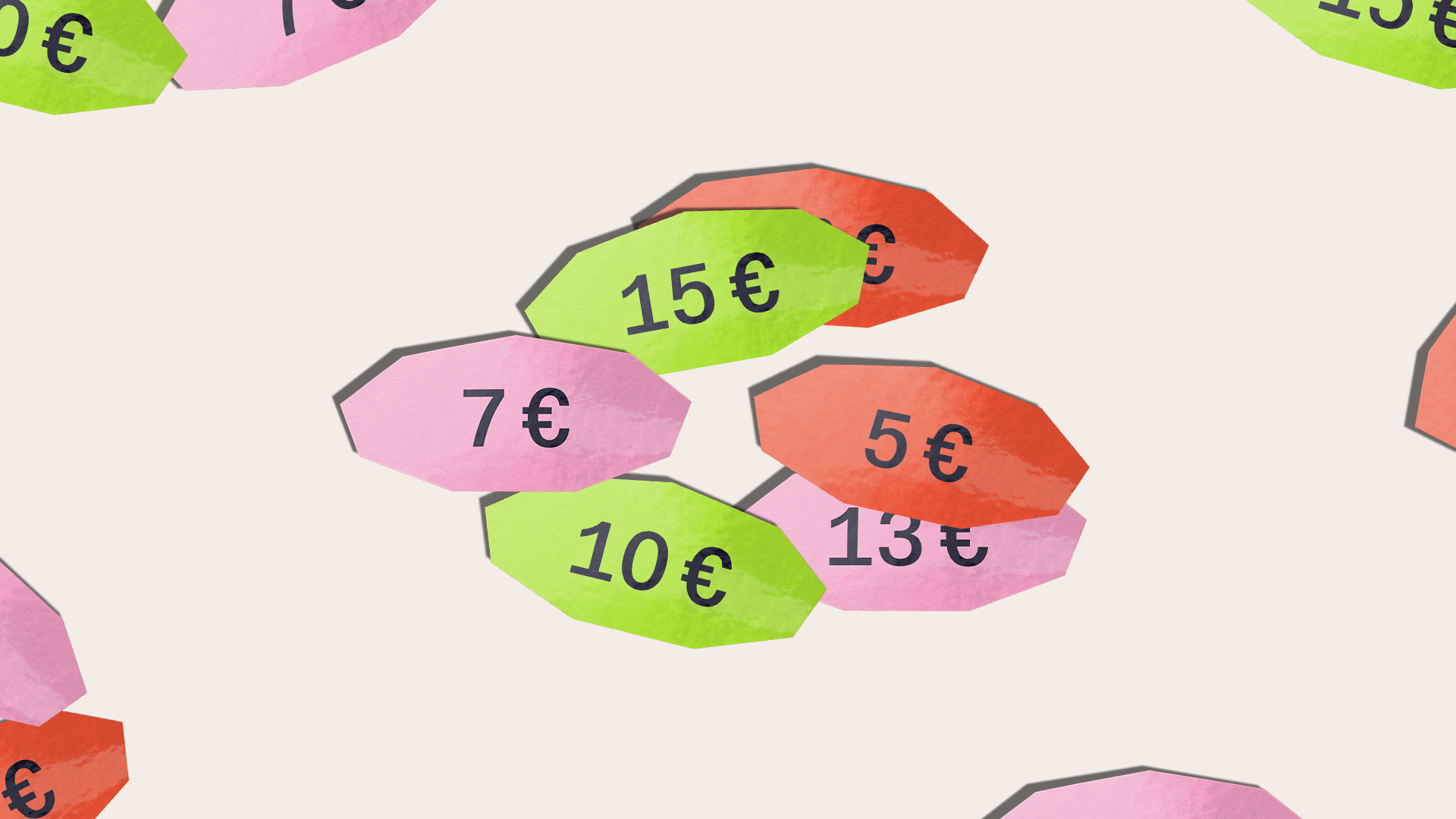
The Kultura color palette is bold, clear, and purposefully structured. Each of the three primary colors, Preface (pink), Margin (red), and Highlight (bright green), is directly tied to one of the shop’s core categories: graphic design, architecture, and photography, respectively.
Two supporting colors, Canvas and Inkwell, serve primarily as background and text colors, providing visual balance and readability.
Together, the palette conveys a sense of intelligence, creativity, and harmony, well-suited to a brand rooted in reading, learning, and the arts.
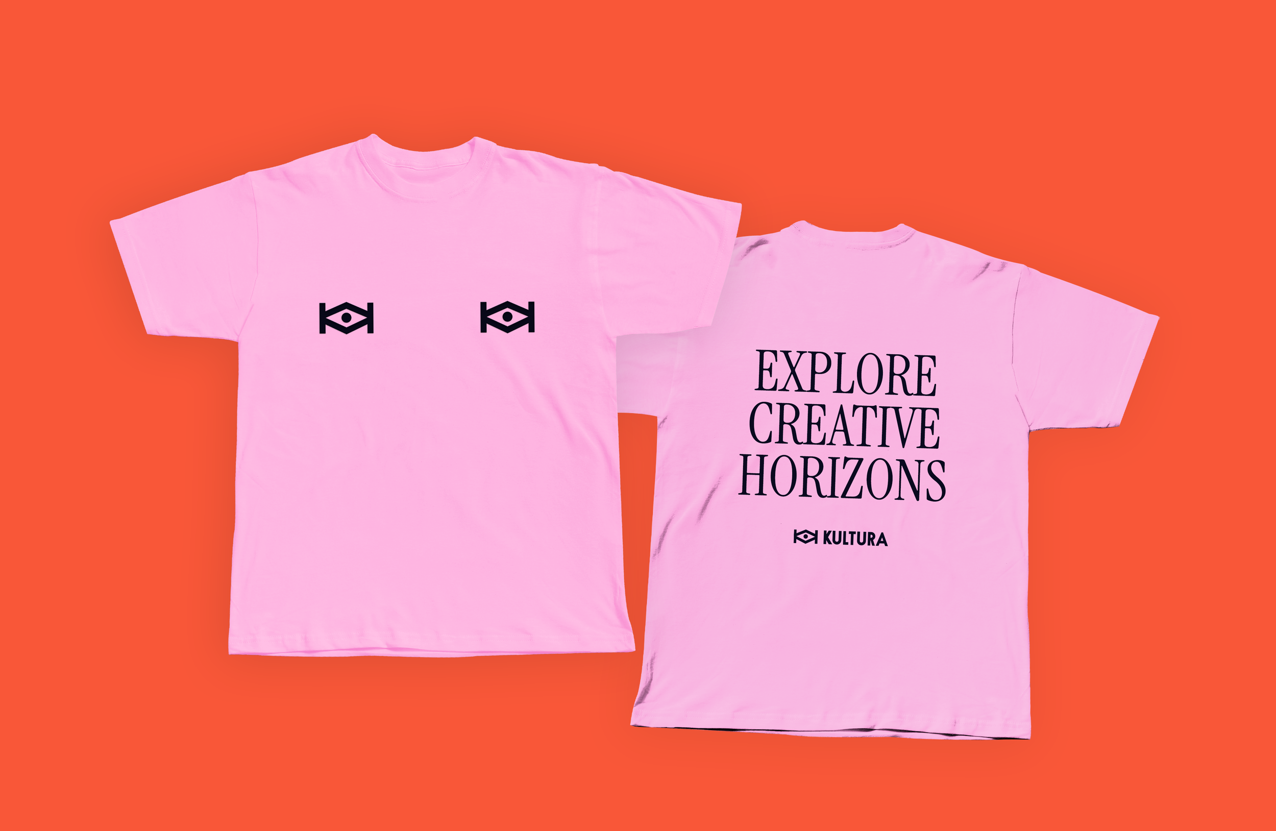


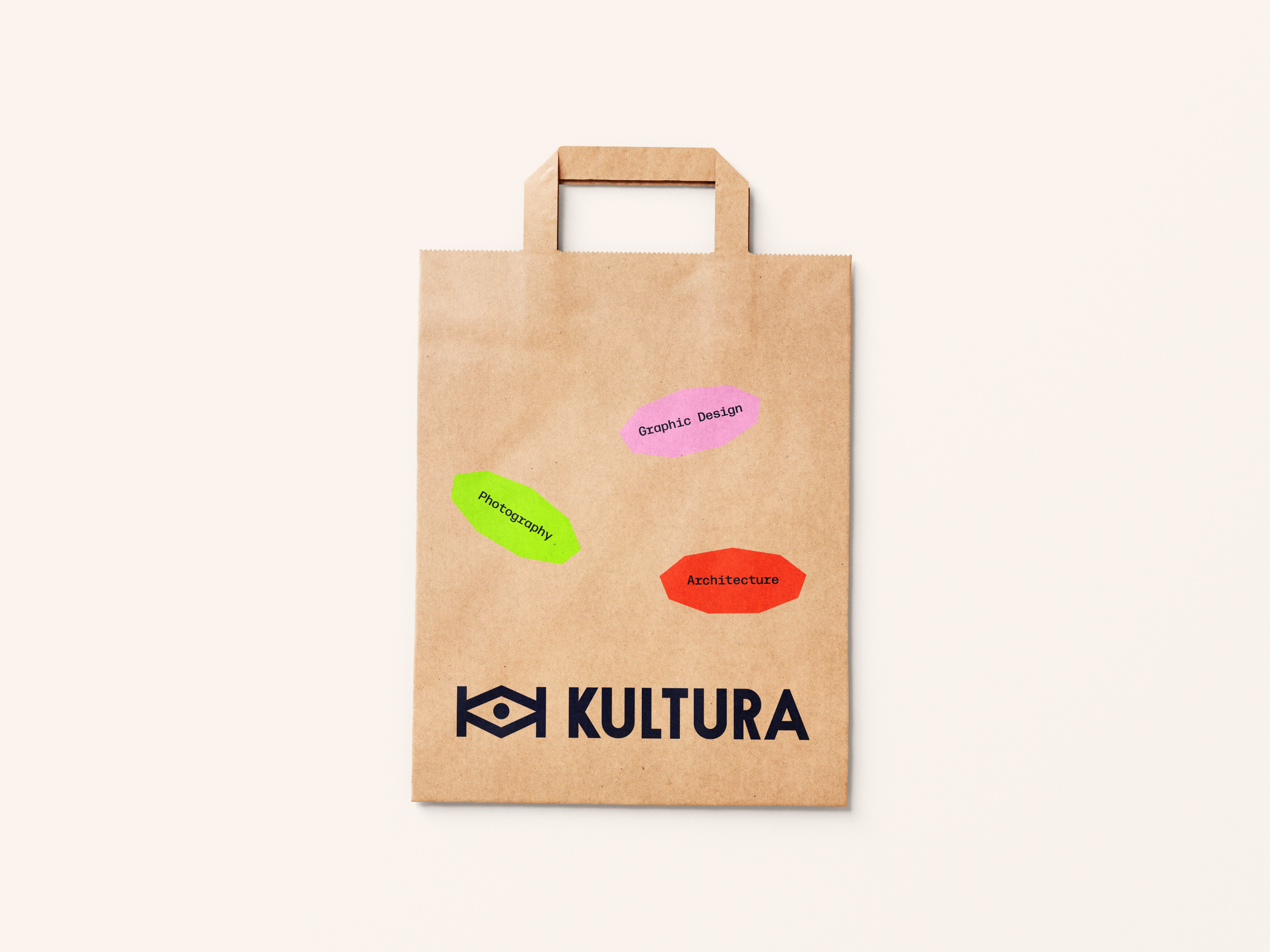
Kultura’s brand is designed to stay strong and consistent, while easily adapting to different uses, whether online, in print, in physical spaces, or on social media. It keeps a clear identity without limiting creativity.

These announcement lecture posters further demonstrate the scalability and flexibility of the brand system. The design approach allows for thoughtful variation, whether utilising the gem shape as a standalone branded element or integrating imagery within it. Both formats feel cohesive, intentional, and aligned with the brand identity.
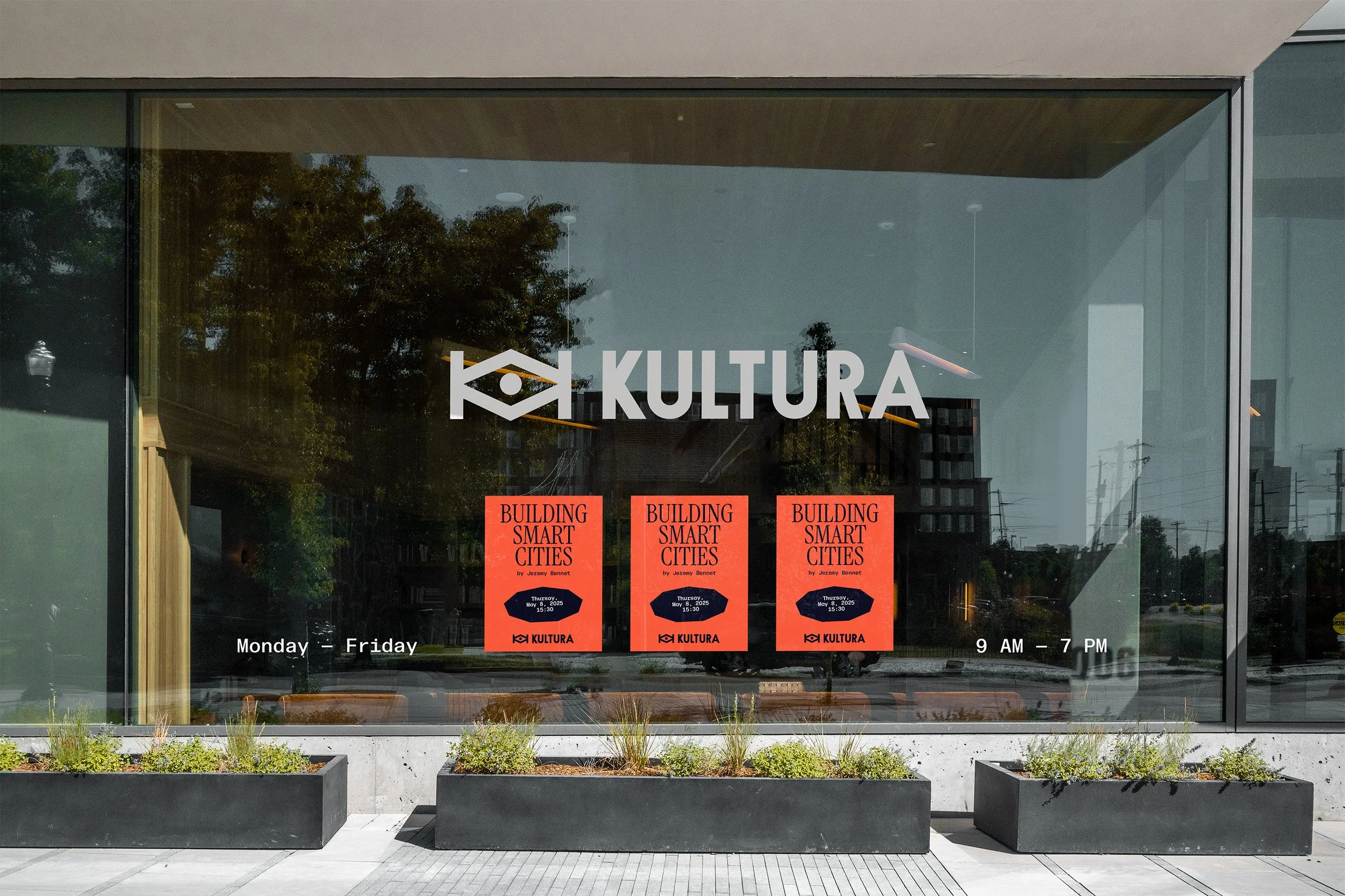
Social media is primarily used to highlight new arrivals and promote upcoming lectures and events.